Monday, October 31, 2022
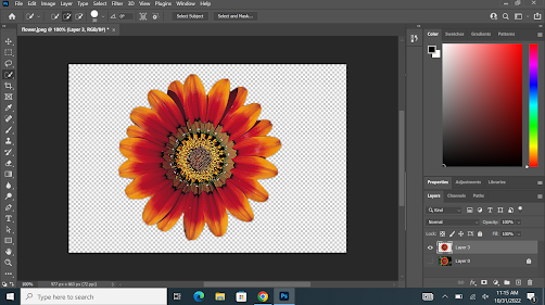
Ancillary task: background, selections, and blending
Friday, October 28, 2022
Audience Research
From my audience research I’ve discovered the best course of action to take with my
magazine genre and what I should and shouldn't add to make it more successful.
Based on the results the most beneficial group to target would be black/African American
females that are 18 and older, although there were some men they were outnumbered by
their counterpart. The evidence suggests that this group is far more knowledgeable on
art topics such as knowing a number of famous artists, which will be important since those
artists would be my main focus in the magazine. A majority of the color scheme answers
were a range from contrasting bright colors to cool pastels, I will keep these choices in
mind when I choose my palette. And the most important piece of evidence I believe was
what drew people towards purchasing a magazine, which a majority agreed was what is
displayed on the cover. With this information gathered I’m confident that I’ll be able to create
my magazine with a level of quality and detail that can hopefully be comparable to
professional magazines.
typography: font types
Thursday, October 20, 2022
Photo Corrections
Tuesday, October 18, 2022
Masthead Development
Masthead #1
THE DA VINCI JOURNAL
The idea behind this name was to take the fame of the late artist Da Vinci and his art journal that was known for containing all of his most well known studies of art. Associating his name while simultaneously connecting the current fine arts community and its history from his era.
Masthead#2
STROKE OF CULTURE
The reasoning behind this name is art is associated with painting, which is done with the stroke of a brush. As art creates impactful moments in history that shapes art culture, the stoke of the brush can be seen as painting in current art social norms, or to be simpler a 'stroke of culture'.
Masthead #3
THE ART SPOT
The thought behind this name was that the magazine would be a place for artist of all types to gather and display/learn from other artist works. Just like a restaurant or treehouse can be a spot for a group that shares the same interest, the magazine would be a manifestation of that idea on paper.
Friday, October 14, 2022
Ancillary task: adding guides
Using the rules of thirds, I can now confidently take and compose my images in a balanced and interesting format, using photoshop with the use of grids and guides.
-
for this lesson I used adobe InDesign. I like the simple design of the interface and the simplicity of the editing option, The similarity to...
-
The thought process behind my font choices were specifically based on their artistic image that they portray. I chose from a wide selection ...
-
. What is the topic of my 300 word article? arts importance and its relationship with teens in todays society 2. How can I illustrate...


